Design Principles in Architecture: How Balance, Scale, and Symmetry Shape Beautiful Buildings
Introduction – The Art Behind Every Building
Have you ever stood before a building and felt instantly calm, inspired, or amazed — without really knowing why? That feeling is the silent power of design principles at work. Architecture isn’t just about walls and roofs; it’s about balance, rhythm, proportion, and harmony that turn spaces into experiences.
Design principles in architecture are like the invisible rules that guide beauty and order. They make a structure feel alive and help architects create buildings that not only look good but feel right.
Whether it’s the calm symmetry of the Taj Mahal, the bold contrast of the Guggenheim Museum, or the fluid proportions of the Heydar Aliyev Centre, every masterpiece follows these timeless ideas.
In this post, we’ll explore what makes architectural design so powerful — through principles like balance, contrast, rhythm, proportion, hierarchy, and emphasis — and how they continue to shape the world we live in today.
1. Understanding Design Principles in Architecture
Before we dive into the specific principles, it’s important to understand what they are — and how they differ from design elements.
Design elements are the building blocks — lines, shapes, textures, and colors. Design principles, on the other hand, are the rules that bring those elements together to create beauty and balance. They help architects decide how to arrange forms, control light, and create spaces that evoke emotion.
Think of elements as the vocabulary of design, and principles as the grammar that organizes them. Without the right balance between the two, even the most creative idea can feel off.
In architecture, these principles bring unity, rhythm, contrast, scale, proportion, and emphasis — turning a simple structure into an unforgettable space.
2. Balance and Symmetry – The Foundation of Stability
Balance is one of the oldest and most important design principles in architecture. It’s what gives a building visual stability and harmony. When a structure feels balanced, our minds naturally relax — it feels complete and well-composed.
There are two main types of balance:
Symmetrical balance means both sides of a structure mirror each other. The Lotus Temple in New Delhi is a perfect example. Its petal-like forms are evenly arranged around a central axis, creating peace and order.
Asymmetrical balance, on the other hand, creates equilibrium through contrast. Fallingwater by Frank Lloyd Wright balances the heavy stone foundation with cantilevered terraces. It feels stable, but in a dynamic, modern way.
Good balance doesn’t always mean perfect symmetry. Sometimes, a subtle offset or visual tension makes a design more interesting — like a dancer perfectly holding a pose mid-motion.
3. Contrast – Making Design Stand Out
If balance is about calmness, contrast is about excitement. It’s the art of difference — using variations in color, texture, material, or form to make certain elements stand out.
In architecture, contrast adds drama and personality. The Guggenheim Museum in New York is a brilliant example. Its circular, white concrete form boldly contrasts the straight lines and glass facades of nearby buildings. The effect? You can’t help but notice it.
Contrast can appear in many forms — rough stone next to smooth glass, light beside dark, or traditional forms placed in modern settings. But balance is key; too much contrast can cause visual chaos, while too little can make a building dull.
Architects use contrast to highlight important features — like an entrance, a staircase, or a façade — guiding the viewer’s eye through the experience of the space.
4. Repetition and Rhythm – Creating Visual Flow
Repetition and rhythm are what give architecture movement. When certain shapes, patterns, or materials repeat, they create a rhythm that leads the eye across a space.
Think of the Sydney Opera House. Its iconic shell-like roofs repeat gracefully, creating a sense of motion that feels both musical and architectural. Similarly, colonnades in classical temples or repeating windows in modern skyscrapers create rhythm through consistent patterns.
Repetition unifies a design. It gives buildings a recognizable character while rhythm adds flow and continuity. When architects play with rhythm — speeding it up, slowing it down, or breaking it intentionally — they keep the viewer engaged.
Just like a song feels complete with a good beat, architecture feels harmonious when rhythm is woven thoughtfully into its design.
5. Emphasis and Focal Points – Guiding the Eye
Every great building has a moment that captures your attention — that’s emphasis at work. Emphasis creates a visual hierarchy, drawing focus to one or more key features while supporting elements play secondary roles.
Architects use light, texture, height, or color to create emphasis. The Dancing House in Prague, designed by Frank Gehry, is a striking example. Its curved glass façade contrasts sharply with the rigid buildings around it, instantly becoming the visual focus of the street.
Even subtle emphasis matters. A softly lit staircase, a tall archway, or a large window framing a view can all direct attention. The goal is not to overwhelm but to guide the viewer’s experience through the design.
When emphasis is used wisely, a building tells a story — revealing its most beautiful or meaningful parts at just the right time.
6. Scale and Proportion – Designing for Human Experience
Scale and proportion are deeply tied to how we perceive architecture. They define the relationship between different parts of a building — and between the building and the human body.
Scale refers to size in relation to its surroundings or to people. Proportion describes how one part relates to another within the same design.
A building that’s too large can feel intimidating; one that’s too small may feel cramped. The best designs find that perfect balance. The Heydar Aliyev Centre in Baku is a masterclass in proportion. Its sweeping curves flow seamlessly, creating spaces that feel vast yet welcoming.
In classical architecture, proportion was based on mathematical ratios — like the golden ratio — to achieve harmony. In modern design, proportions often respond to human movement and comfort.
When architects get proportion right, people feel naturally at ease inside the space — even if they can’t explain why.
7. Hierarchy – The Architecture of Attention
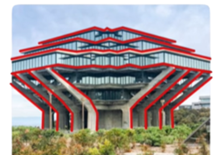
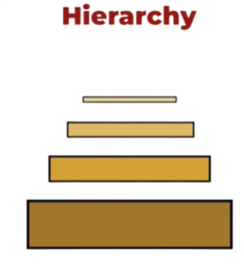
Hierarchy is how architects guide your eyes through a building. It tells you what’s most important — the entrance, the dome, the tower — and what supports it.
Good hierarchy helps people understand space intuitively. For example, in Humayun’s Tomb in Delhi, your eyes are drawn first to the central dome, then along the symmetrical pathways, and finally to the gardens. Everything points toward the heart of the design.
To direct the viewer's eyes to specific parts of a structure. It's a way to establish a guiding visual element for a structure by manipulating the viewer's experience.
Variety of factors to establish hierarchy, Size, color, shape, Location and Contrast.
Humayun’s Tomb, Delhi
Hierarchy is created through size, placement, light, and form. A tall spire, a brightly lit atrium, or a bold texture can all act as visual cues.
Without hierarchy, a building can feel confusing or flat. With it, even complex designs feel organized and purposeful.
8. How Design Principles Work Together
No single principle stands alone. The magic of architecture happens when all the principles — balance, contrast, rhythm, proportion, and hierarchy — come together in harmony.
Take the Taj Mahal, for example. Its symmetry gives it calm, its proportion makes it graceful, and its central dome creates emphasis. Light and shadow add contrast, while repetition of arches and minarets establish rhythm.
Great architecture is like a symphony — each principle plays its part, and together they create a masterpiece. Ignoring one can throw the entire composition off balance.
The best architects think holistically. They see how structure, function, and emotion intertwine — designing not just for the eyes, but for the human soul.
9. Applying Design Principles in Modern Architecture
While the principles remain timeless, their application evolves with technology and culture.
Modern architects like Zaha Hadid and Bjarke Ingels reinterpret classical ideas with digital tools and sustainable materials. Their designs use fluid forms, dynamic contrasts, and innovative proportions to create new expressions of space.
For example, the Galaxy SOHO complex in Beijing by Zaha Hadid uses continuous curves that defy traditional symmetry yet feel balanced through movement. Meanwhile, sustainable architecture applies proportion and rhythm to integrate with nature — think green walls, solar facades, and biophilic design.
Today, architects blend technology with timeless principles — proving that while styles change, the foundation of design remains the same.
10. FAQs – Understanding Design Principles in Architecture
Q1. Why are design principles important in architecture?
Design principles help architects create harmony between form and function. They ensure that every part of a building contributes to its beauty and usability.
Q2. What’s the difference between design elements and principles?
Elements are the raw ingredients — like line, color, and texture — while principles are how those ingredients are arranged to form a coherent design.
Q3. Which design principle is most important?
All are equally essential. Balance provides calm, contrast adds excitement, and proportion ensures comfort. Together, they shape how people feel in a space.
Q4. How can students learn to apply these principles?
By observing real buildings, sketching compositions, and experimenting with small design projects. Learning comes from seeing, analyzing, and creating.
Q5. Can design principles evolve with time?
Yes. As materials, technology, and lifestyles change, so does the way architects interpret and apply these principles.
11. Conclusion – The Harmony Behind Every Masterpiece
Every great building — from ancient temples to futuristic museums — is built on invisible ideas that shape how we see, feel, and move. These design principles in architecture are not just technical rules; they are expressions of balance, beauty, and human emotion.
When we walk through a well-designed building, we experience its rhythm, feel its scale, and sense its harmony — even if we can’t name what’s happening. That’s the true magic of architectural design.
Whether you’re a student, designer, or simply someone who loves buildings, understanding these principles helps you appreciate architecture on a deeper level. The next time you pass by a structure that takes your breath away, look closer — you might just see balance, proportion, and rhythm quietly working together.

.jpg)


.jpg)
.jpg)
.jpg)

.jpg)
.jpg)

0 Comments